FEAR [/ˈfir/]
Noun
An unpleasant emotion caused by the belief that someone or something is dangerous, likely to cause pain, or a threat
“And, here we go, life’s waiting to begin…”
That’s a direct quote from my good buddy, Tom DeLonge, formerly of Blink 182 and Box Car Racer, and now Angels & Airwaves… I’m just kidding. Tom DeLonge is not a good buddy of mine. However, we do physically know each other. No, no… I’m serious. Not like I was in the audience during an AvA show and our eyes connected and we had a moment where we felt like one as I sang his own words back to him. But, like… We really know each other from an actual video I DP’d about him and Blink and AvA and To The Stars. I would say we are pretty good acquaintances. Like, to the point where if we got to spend just a tad more time together, I think we’d be in each other’s top eight MySpace friend. I feel like you don’t believe me. I have photographic evidence. I’m being serious, dammit! AH OH, unintentional Blink 182 reference right there. Fuck, I need to stop. Sorry. But we REALLY DO KNOW EACH OTHER, OKAY?!?!?!?!
More seriously, the opening quote above should actually say something to the effect of, “And, so sit back and enjoy this unique journey that is to unfold before your eyes.” Basically, right now, think of me as Willy Wonka (Gene Wilder, not that Johnny Depp bull shit version), and the five to seven people that read this blog (you) have won a golden ticket to see the inner workings of my chocolate factory. No, I don’t have a damn chocolate factory. If I did, I wouldn’t have gone on a 10-mile UPHILL MTB ride at 10,000ft elevation with Wes Williams after he told me it was only five miles and then I got lost from our group and chased by a fucking bear. But, instead, over the course of the next three weeks, I am going to be breaking down a brand-new short film I’ve been hush-hush about that I DP’d ft off-road racer, Trevor Stewart, entitled: No Runners. The film will release right here on vurbmoto on Tuesday, September 8.
In these next three blog installments, I will breakdown our pre-production days, our production days, and our post-production days with behind-the-scenes photos, videos, and words. Lots and lots of words. A kinda sorta crash course film school about this project from a guy that doesn’t really know that much to begin with and almost got kicked out of high school 15 years ago and didn’t go to college or film school. So, let’s begin, shall we?
Photos: Brandon Carter
PRE-PRODUCTION – CONCEPT
In March of this year, I had come up with an idea for a passion project (much before I knew vurbmoto was TRULY coming back) and, after talking it over with my good friend, Brandon Carter, we started devising a game plan to bring it all to life. However, after about a week of pre-production and research and a half day of shooting, I quickly realized this plan was not going to work out even slightly how I had envisioned. I remember driving home on the 15 freeway, traveling northbound around 2:00 p.m. from this shoot. Brandon was in the passenger seat, we had no radio or music on. It was just quiet, and I was thinking to myself, “This isn’t going to work. Not a chance in hell we can get the subject to do what is in my mind.” And then, almost instantly, like a light bulb being flicked on, I think to myself, “Trevor Stewart!” Right away I knew that he was the right person for my vision. I didn’t say a word to Brandon, though. I kept it to myself until I spoke to Trevor. And, that evening, I slid into Trevor’s Instagram DMs with what was surely a 10,000 word essay about my idea and why I thought he’d be perfect for the concept. Instantly, Trevor replied and agreed.
Once Trevor was onboard, I needed to adjust the concept a little bit so that to fit his personality and style. This meant, no formal sit-down interview, no archival imagery; what I wanted to make was truly a narrative short film. Essentially, the film is about mental illness and a human being battle with depression. The origins of this concept, to be open and honest with you, comes directly from my own mental health struggles, bouts of depression, insecurities, and illogical fears that have, at times, truly crippled me to the point of not being able to get up out of bed. Trevor and I discussed these themes and, one of the first things he told me was how happy he was that I reached out to him with this idea because he had just worked through his own demons, battling mental health. Trevor rides for SLR Honda (factory supported team), he’s won championships and, from the point of view on social media or any type of press he receives, it looks like he’s got one hell of a life. In reality, it is quite the opposite. Trevor had been dealing with serious mental health issues that left him questioning who he was as an individual and as an athlete. The discussions that we shared really allowed me great insight into his frame of mind and shed light on how I wanted to create the visual world of this film. After these discussions, my next step was to create a visual treatment of the world I wanted to bring to life.
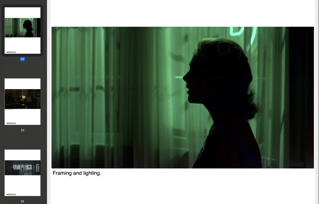
Lawrence Sher, ASC (Hangover 1, 2, 3, and Joker) recently launched a wonderful website called ShotDeck that has curated tens of thousands of frame grabs from movies and allows you to create a deck based on your desired needs. Exteriors, interiors, time of day, aspect ratio, format, frame size, lens size, and so on. The search ability is unbelievable and Lawrence and his team continue to update and refine their site. Anyhow, using the notes I had from Trevor and the ideas for a visual look in my mind, I proceeded to ShotDeck to create my visual treatment. From the beginning, I knew exactly how many interior locations we would have vs exterior locations and what type of locations and time of day I was wanting. This made my time on ShotDeck creating my treatment move efficiently. My deck referenced films such as No Country for Old Men, The Master, Sicario, Out of the Furnace, Vertigo, Lost River, The Road, Moneyball, and several others (visual treatment below). Some frames were to reference specific composition, or specific color palettes, specific lighting, specific time of day, specific emotion, and so forth. For me, on narrative films especially, these visual treatments are a great tool to simply wrap your head around a rough outline of the overall look you’re after and it can help your talent better understand tones, emotions, and flow of a film.
PRE-PRODUCTION – LOCATION SCOUTING
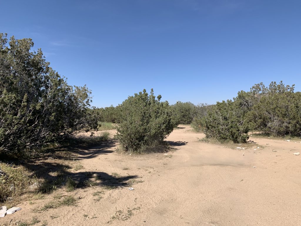
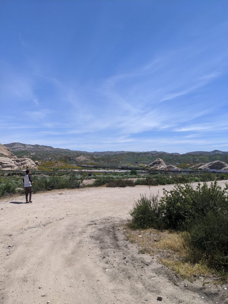
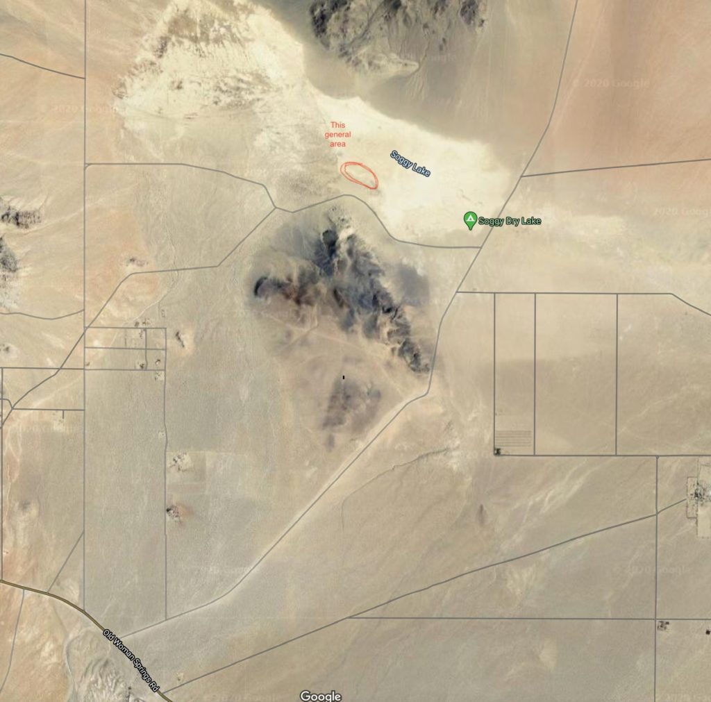
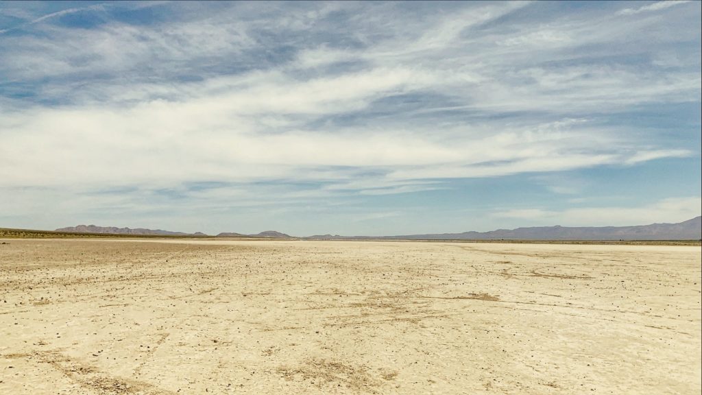
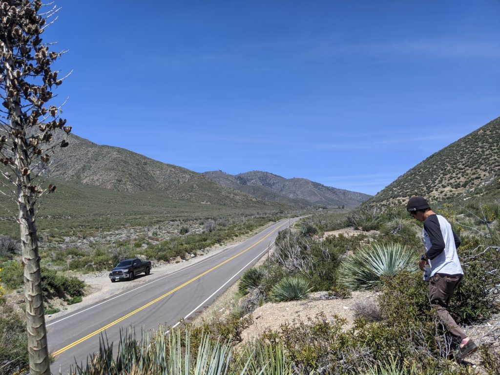
Overall, it took me a few weeks of working on the visual treatment to land in a place that felt as if I was in the right direction. While working on this treatment, I also knew locations would play big factor in making this film feel authentic and true to itself. In total, we spent two days doing location scouts. But, before Brandon and I ever hit the road to scout locations, I spent roughly a day or two on Google Images and Google Maps looking at potential locations. One location that was there from the start was a dry lakebed. Originally, I had intended on shooting our lakebed sequences at the El Mirage Dry Lakebed in the Mojave Desert. However, because of all that’s happening the world, the lakebed was closed (this was in April). So, I knew I needed to find another lakebed that fell into a more “wild west” vibe that would be open to anyone at any time and not under the authority of the Bureau of Land Management. It took some time to find the right location, but eventually I stumbled upon Soggy Dry Lakebed in Lucerne Valley, CA. I needed a location that felt truly alien and not of this world. A location that, if I point the camera in one direction, we have these dry, rocky, mountain scapes, but if I turn my camera 90 degrees or 180 degrees, it’s wide open as far as the eye can see. Based on the limited images I found on Google, this seemed like it might be the place. Thanks to Google Maps, I also found a location for a specific driving sequence I needed of Trevor and I knew for how I wanted to compose the master shot, it needed to be something away from the public eye, yet sat in some sort of valley with mountains surrounding it to emphasis the scale of our Earth and the reality of how small, we as humans are. Once I had these potential locations queued up, a few days later, Brandon and I hopped in my vehicle and set out to scout both of these locations.
On projects like this, scouts are an imperative part of pre-production. Aside from figuring out where camera will live, where talent will live, where and how to light, it’s allowing you to see what potential challenges you may have on the day, such as what loading in and loading out looks like. For example: for our driving sequence, once we knew this location would be visually perfect and we knew where camera and talent would live and where the sun was coming from and going to, we were watching the flow of traffic. Do we have a lot of traffic? Is there intermittent traffic? Is there no traffic? Do we see any police officers coming through whatsoever? Where is a safe place for us to park, build camera, and stage? Where is a safe place for Trevor to turn around at? Do we have proper cellphone service in case of emergency? Once we have all those questions answered, we can relay that information to Trevor and let him know where to go and what to expect. The same for our lakebed sequence. Because of Google Maps, we knew that the drive into the lakebed was several miles on washboard roads. So, aside from making sure the location was visually what we needed, we also needed to make sure we could safely access the location in our vehicles. And, for our lakebed sequence, we had a bigger crew than our other days. Hence why it’s imperative to scout, not just for the obvious (creative needs) but for the logistical aspect to avoid any and all headaches so that crew and talent are on the same page at all times.
We would have one more day of location scouting for our campfire sequence. I knew we needed to light a fire at night and I knew that we needed to do it somewhere away from public eye so that not to have police called on us, especially because we would have some yelling and glass breaking. Luckily, Trevor knew of a potential location that wasn’t too far away from our driving sequence location. And, that location met all the requirements I was needing it to have. I should also mention that, on these scouts, I would use my iPhone to take photos and videos of each location to further help visualize each sequence and potential camera moves and, at times, have Brandon stand in for me. I would use these to share with Trevor, help me further build out a shot list and work on the blocking, but also to use as reference on the day of production as needed. A kinda of cheat sheet to help us remember certain elements we were after.
We did have one location we did not scout, which was Trevor’s house for the bedroom sequence. However, I had Trevor send me photos of the bedroom that we would use so I could see where windows were placed, bed placement, and to help me get as good of an idea as possible of how natural light was acting in the room. From there, it helped me to build out the blocking of the scene and to design my lighting concept so I had some sort of a game plan upon arrival come day one of shooting, and we weren’t going in totally blind.
Check out some behind the scenes footage from Kyle and Brandon:
PRE-PRODUCTION – ASPECT RATIO & LENSING
Once locations, visual treatment, and a shooting schedule was in place, my next course of action was deciding on aspect ratio. One thing that I will stress a lot throughout the breakdown of this project is that every single decision that was made on this film was intentional. This wasn’t about creating imagery for the sake of it looking cool, my intentions throughout this process was to make sure the visuals serve the story to the best of its ability, and did not distract from the story. Oddly enough, beautiful cinematography, if it doesn’t serve the story, is wildly distracting.
An example: The Founder. The cinematography of John Schwartzman, ASC and the lighting by gaffer, Dan Cornwall was absolutely incredible. But, in my ignorant and subjective opinion, it was far too perfect and beautiful. To the point where it was taking away from the story and left me distracted and annoyed throughout the entire film. Now, don’t get me wrong, if I could execute even a single image at the level, I would shit my pants in excitement. I’m simply a student of my craft, trying to learn what I like and don’t like and what I think works or doesn’t work. Again, all subjective. Anyways, back to aspect ratio and intentions…
In the past, I’ve shot at a 2.4:1 aspect ratio, not because it served the story or conveyed a specific emotion, but purely because I thought the widescreen look was cool. But, in reality, aspect ratio plays an important part in the emotion and story being conveyed. From the start, I knew this wasn’t going to be your standard 16:9. I knew it would be either a 4:3 or a 2.4:1 ratio. The idea is I’m creating a visual language to convey a sense of loneliness, isolation, and claustrophobia that Trevor is feeling internally. I wrestled with the idea of which ratio for quite some time. The more I thought about my personal experiences of depression and anxiety and what Trevor conveyed to me, I felt like the right decision was 2.4:1 aspect ratio (widescreen). The idea here is that Trevor feels incredibly alone and insignificant from everybody around him. Thus, this aspect ratio helps us convey the feeling of a very large world that is constantly surrounding him and closing in on him, which is making him feel incredibly small and insignificant. Now, to compliment this idea, in terms of lensing, I would decide to shoot almost everything on a Rokinon DS T1.5 35mm to help us further exaggerate the walls and world around him closing in and us never getting that close to him. Staying away from him is to further push the feeling that he is alone and nobody is near him or can relate to how he’s feeling. There is a moment in the campfire sequence where we have three shots and each individual shot gets closer and closer to him as if the weight of everything is finally crumbling onto of him and we can feel that both visually and through is performance. And, then he hits his breaking point when the camera is in his face. Again, all intentional by design and decided in pre-production.
PRE-PRODUCTION – EXPOSURES AND TIME OF DAY
At the end of the day, as cinematographers, we are always chasing shadows. We want shadows and contrast and texture. Shooting at blue hour or golden hour is all we ever want. However, for this project, again, to serve the story, I knew that we actually couldn’t be shooting in the “good light” all of the time. Purposely, I wanted to shoot mid-day when light was harsh and flat. I wanted it to look ugly and hot and uncomfortable or really cold and lonely. Why? Because we want to visually create a language that explains Trevor’s different emotions. Life isn’t always beautiful sunrises and beautiful sunsets. Rather, it can be quite the opposite quite often. Thus, shooting at certain times of day when light was flat really helped us bring that idea to life.
And, the same goes for exposure. I really prefer doing as much as possible in-camera in order to make the post-process as efficient and easy as possible. Thus, during some sequences, I purposely over-exposed the image in-camera to create a hot, ugly, dirty feeling and then I knew in post while color grading, I could continue to exaggerate that look even more. I have to admit, it was weird at times, going against the rules you know to create the best image possible for the story. But, I realized throughout this process that some of these rules are more so guidelines that are meant to be ignored at times to best tell your story. It was a fun moment when I realized that and made me feel like I had a little bit of growth and slightly better understanding of what the hell I am doing behind the camera.
PRE-PRODUCTION – THE GEAR AND THE CREW
For my gear heads out there, since this was a passion project, we used gear we already had available to ourselves. Had there of been a budget, I certainly would’ve loved to have rented different lenses and filtration.
-RED GEMINI Super35 5k
-Rokinon T1.5 Glass: 24mm, 35mm, 50mm
-Canon L-Series f/2.8 IS 70-200mm
-Kessler Crane Pocket Jib 8’
-Two 4’ Quasar LED X-Crossfade Lamps
-One 2’ Quasar LED X-Crossfade Lamps
-One 6’ Frame
-Various rags, diffusion cloths, bounce, negative fill, flags
-Various gels
-Tiffen Variable ND 77mm
Also, thanks to Martin Fobes and Chris Ray, for our lakebed sequence, we had as follows…
-RED Weapon Helium 8k (we shot in 6k on Helium)
-Fujinon T3.5 20-120mm
-Ronin 2
-The Ray Rig
-Kessler Crane Killer Shot
-SmallHD 7’ Focus Bolt 500 Monitor
-Teredek Bolt 500 XT (SDI/HDMI)
-Wireless Follow Focus System
In terms of actual crew, it was a small one. Very, very small. Aside from our lakebed sequence which included Martin Fobes, Chris Ray, and Sam Sosnowski, this entire project consisted of myself, Brandon Carter, and Stu Alfano. And, if you want to get a good laugh, let me know break down the roles here.
-DP/Cinematographer: Me
-Director: Me
-Editor/Colorist: Me
-Gaffer, Grip, Rigger: Me
-Written By: Me
-Assistant Camera: Brandon Carter
-Grip, Rigger: Brandon Carter
-Still Photography: Brandon Carter & Stu Alfano
-Camera Car Crew: Martin Fobes, Chris Ray, Sam Sosnowski
-Graphic Design: Stu Alfano
-Executive Producer: Me, Brandon Carter, Trevor Stewart, Stu Alfano
-Supervising Scientist: Karyn Cowling
You get the gist. It was a bare bones crew at all times. Just a small group of individuals that believed in the idea and wanted to create something they felt was unique and fun and to push themselves to think out of the box. Literally I couldn’t not have done any of this without them. It was, unequivocally, a team effort and there are not enough In N Out Burgers and thank yous
I can share with my crew to express the gratitude I feel for their contributions and belief in me and this project.
PRE-PRODUCTION – THE END GOAL
I’ve explained this to Brandon, Stu, Wes, Trevor, and all those involved in this project. The goal with this film has nothing to do with the amount of views it receives or the amount of praise or (the most likely) amount of “What the fuck did I just watch? Wow that was stupid.” Truthfully, I could give a shit about that. Honest to God, my entire goal with this project was to simply push myself creatively as far as I could. To create a piece that made me think about every aspect of my craft and that every time I hit record, it was with reason and purpose. I wanted to create something that was far out of my comfort zone and see how badly I failed. For example, gaffing (lighting) is incredibly difficult for me. Lighting as a whole scares the fuck out of me and causes me stress and anxiety, so how do I learn to improve and conquer that fear? I do it myself. Lighting this entire thing myself, without the assistance of an actual gaffer was scary. I didn’t think I could do it, but with every setup, I took my time, really thought about what I was trying to do and understand what my lighting was doing. And, for the most part, with the help of Brandon listening to my ideas and letting me know if they made sense or not, I accomplished what I wanted with lighting. The same goes for the visual component. This entire film is basically me putting myself deep out of my comfort zone and trying new technique after new technique hoping I don’t fuck it up too badly. I wanted to create a piece that mattered and addressed mental illness and depression in an abstract fashion. To have something that can make us think and feel… Something, anything. Overall, I wanted to create something that I knew I put my whole heart into and can be proud of, no matter the views, likes, comments, I don’t care. Because, at the end of the day, I know I did my absolute best with this project and I can be proud of that. I wanted to prove to myself and to certain individuals that I am capable as a DP and that maybe I shouldn’t be overlooked or laughed at. And, most importantly, I wanted to create my version of a piece of art and, I think I’ve done just that. At least for myself and those involved in the film. In the words of David Goggins, “Only you can master your mind, which is what it takes to live a bold life filled with accomplishments most people consider beyond their capability.”
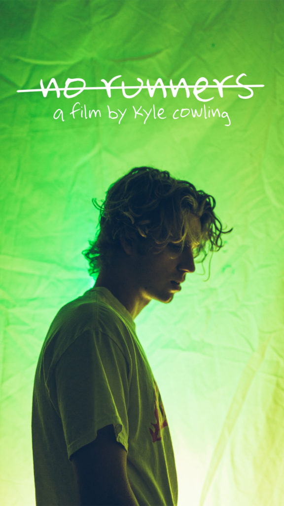
Okay, so, hundreds of hours later, this first installment is complete! I hope this was somewhat insightful and interesting to you. If you have any questions about the pre-pro process, feel free to leave a comment below and I will get back to you! In the next installment of FoM, we will be diving into the actual production of the film starting at day one! This entire project took five months to complete, and it’s exciting to finally talk about out it and share our poster art work and a BTS glimpse into the process. Because, holy hell have we been sitting on this one for a while!






Let’s fuckin goooo
Now this is something worth getting excited about.
Thanks, Jarryd. I certainly hope so. It will, at the very least, be an extremely odd approach on a dirt bike rider/dirt bike video.